Most landing page advice tells you to pick one. Form at the top, or a button that scrolls down to it. Neither one wins every time, and the advice that says otherwise is the advice getting you into trouble.
It comes down to a single thing: how much trust the visitor needs before they will hand over their details. Founders and agencies keep treating this as a straight yes or no. Then the wrong call meets the wrong traffic source, and a conversion rate that should have been fine quietly falls over. Bury the form under three screens of copy and you lose the person who already decided to buy. Park it up the top and you lose the person who has decided nothing yet.
So let’s fix the question. By the end of this you will have a framework instead of an opinion, and a short test you can run on your own page today.
Key takeaways
- There is no universal answer. The right placement depends on traffic source, buyer awareness and how much trust the offer needs.
- Form-first suits high-intent traffic that already searched for the exact thing you sell.
- CTA-first suits cold traffic, complex or high-ticket services, and brands the visitor does not know yet.
- Four questions decide it: traffic source, form length, price point and brand familiarity.
The case for putting the form first
Form-first puts the fields where the visitor lands. No scrolling, no persuasion detour, just the ask. It works because of a plain fact about how people behave online: they do not read most of a page. Nielsen Norman Group’s 2018 eyetracking study analysed more than 130,000 fixations and found that 57% of viewing time happens above the fold, then drops away sharply below it. If the visitor is already sold, put the form where their eyes already are.
That is the situation with Google Ads and other high-intent search. Someone who typed “commercial cleaning quote Perth” has already done the convincing themselves. Make them scroll past a pitch they never asked for and you have added friction, not persuasion.
There is a catch. A form asks for commitment before the page has earned any, and on cold traffic that meets an unfamiliar brand, it reads as presumptuous. Abandonment climbs. It also spends the one thing your first screen barely has, which is room. Every field up there is space you are not using to prove you are worth the enquiry.
The case for leading with the CTA instead
CTA-first with a quick scroll to form flips the order. It makes the argument first, then asks. Problem, solution, why you, and only then a button that scrolls to the form or reveals it. That order respects a visitor who has not decided, and it lets the case land before the form gets in the way.
Repeated CTAs are the real trick here. Drop the same button after each proof section and you catch people the moment they are convinced, rather than making them scroll back up to find it. This is also the layout for anything that takes real thinking time. A $15,000 service. A multi-year contract. A category the visitor has never heard of.
The price you pay is a click, and sometimes a form the visitor has to go looking for. Every extra click is a chance to lose someone. And if that button does not scroll cleanly to a form the visitor can see, or the form only shows up in a slow modal, you have traded one friction point for a worse one.
The one variable that actually decides it
Drop the “best practice” language and one question does nearly all the work. How much trust does this particular visitor need before the ask is fair? Traffic source is the quickest way to read that, because it tells you how much of the convincing already happened somewhere else.
| Traffic source or context | Recommended layout | Why |
|---|---|---|
| Paid search, high-intent branded or category search | Form-first | The visitor searched for the exact thing on offer. They arrive pre-sold. |
| Direct traffic, retargeting to a warm list | Form-first | Familiarity did the trust-building before the page even loaded. |
| Cold social (Meta, LinkedIn cold audience) | CTA-first | Nobody searched for this. The page builds the case from a standing start. |
| High-ticket or long-consideration services | CTA-first, with repeated CTAs | Big decisions need proof, not a prompt. Repeat the CTA after each proof point. |
| Unfamiliar brand, first touch | CTA-first | Trust is not earned yet. Asking before proving reads as presumptuous. |
Form length shifts the maths too. Name and email carries almost no trust cost, so a two-field form can sit up top even on moderately cold traffic. A twelve-field quote request is a different animal. That one usually wants the CTA-first treatment whatever the source.
What we have seen change when this gets fixed
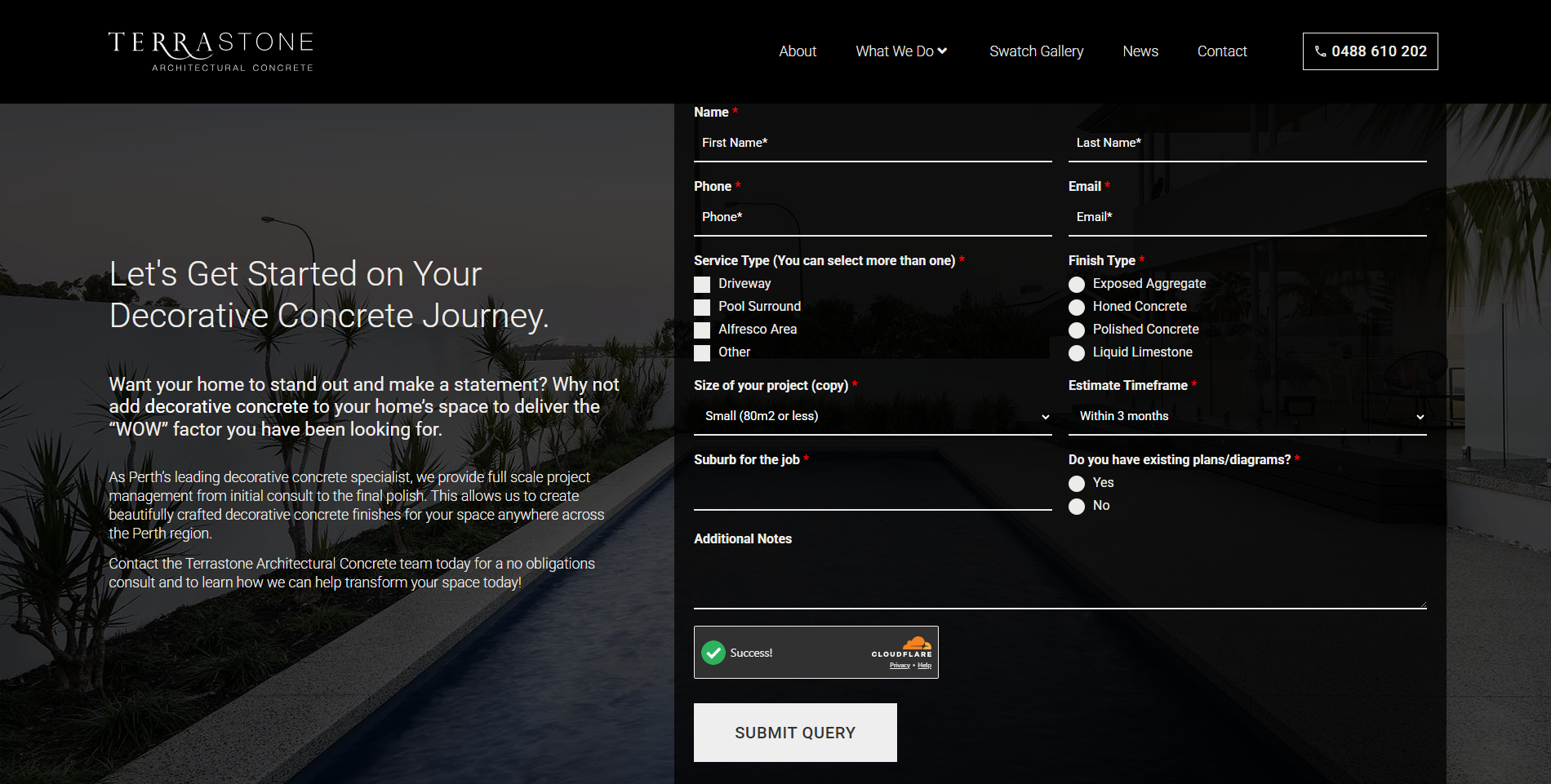
Here is eight years of evidence on the exact variable this decision rests on. A Perth trade specialist we have worked with since 2018 got to the point where organic search drove 70% of sessions and 78% of conversions. These were people searching for the precise niche service the business offers, about as pre-sold as traffic gets. So we did the opposite of the usual advice. We made the form longer, adding project-size and scope questions that would flatten a cold-traffic page. Enquiries fell 15.57% over the next year, on purpose. The ones left were buyers ready to go. That freed the owner to work qualified leads instead of chasing every enquiry that came in, and the business now books out eight to ten weeks ahead. Friction on a form is not good or bad by itself. It depends on what the business actually needs: its capacity, its capability, and the strategy behind the page.
A simple test for your own page
Before you touch the layout, run your page through these four questions.
- Where is the traffic coming from? Paid search or a warm list points to form-first. Cold social or display points to CTA-first.
- How long is the form? Two or three fields carry almost no trust cost. Anything longer needs the case built first.
- What is the price point or consideration length? A quick, low-commitment offer can ask early. A high-ticket or multi-month decision needs proof before the ask.
- How familiar is the visitor with your brand? Existing customers and warm referrals need less convincing than someone meeting you for the first time on this page.
Score your page honestly against all four. If three or four point the same way, that is your layout. If they split, go CTA-first. It costs one extra click, but a page that asks too early loses visitors it never gets back.
Key takeaways
Form placement is not a design preference. It is a trust decision. Match the layout to how much convincing the visitor needs before the ask is fair, and the “best practice” argument mostly sorts itself out.
- Form-first suits pre-sold, high-intent traffic where the form carries little friction.
- CTA-first suits cold, high-consideration or unfamiliar-brand traffic where the case has to be made first.
- Traffic source, form length, price point and brand familiarity are the four questions that decide it, not a generic rule.
- When those four disagree, CTA-first is the safer default.
If you are weighing this up for your own page and want a second opinion on the layout that suits your traffic, here is how our conversion rate optimisation process works.
Frequently asked questions
Should a lead generation form always be above the fold?
No. Above-the-fold forms suit high-intent traffic that has already decided, like paid search. Cold or unfamiliar traffic usually converts better when the form turns up after the case has been made, not before it.
Does a longer form always perform worse than a short one?
No. Length raises the trust cost of the form, not the abandonment rate by itself. A long form matched to genuinely qualified, high-intent traffic can beat a short form shown too early to cold traffic.
How many CTAs should a landing page have?
One destination, repeated as needed. A single button pointing to the same form, dropped in after each proof section on a long page, catches visitors when they are convinced without the paralysis of competing offers.
Sources
- Nielsen Norman Group (Therese Fessenden), “Scrolling and Attention”, retrieved 2026-09-10, https://www.nngroup.com/articles/scrolling-and-attention/
- Mangools KWFinder and SERPChecker, keyword and SERP data for “landing page best practices” and related terms, location Australia (id 2036), retrieved 2026-09-08 (internal Sherlock SEO brief)