A visitor can like your website and still leave without contacting you. Sometimes the answer they need is buried. Sometimes they have the facts but cannot picture working with you. Sometimes they were ready to enquire before they arrived, yet the contact path took too much effort to find.
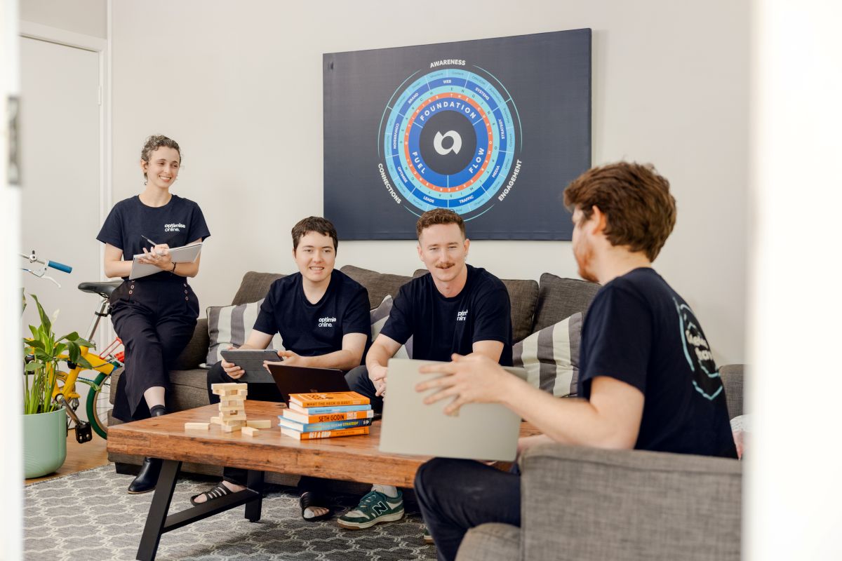
The Customer Saga Framework® is Optimise Online’s proprietary method for designing website pages around the customer’s decision, rather than the business’s list of things to say. One useful way to understand it is through the three customers every page needs to serve: the time-poor or referred visitor, the emotional decision maker and the person who wants every detail.
These are not three fixed personality types. The same person can need a quick phone number on Monday and a thorough explanation on Thursday. A good page lets each person find what they need without making anyone else work harder.
Optimise Online is a Perth digital marketing agency founded in 2013. Our in-house team uses this approach to plan website content and design, because a page must help a real person decide what to do next. If you already know you want help with your website, you can get in touch with Optimise Online now.
What to keep in mind
- Give ready-to-contact visitors orientation and a clear contact path near the top.
- Use the middle of the page to help people feel understood and see credible proof.
- Put the substantive detail further down, while making sure it is easy to find and consistent with the promise at the top.
Why can a well-designed website still lose a good enquiry?
A site can be attractive and technically sound while asking its visitors to do too much interpretive work. The headline says the business is passionate. The next section lists services. The contact button sits at the bottom. None of this tells a new visitor whether the business handles their particular problem, or what will happen if they make contact.
It is easy to write a page in the order the business thinks about itself: our story, our services, our credentials, our process. The visitor arrives with a different order of questions. Am I in the right place? Will these people understand what matters to me? Can they do the work? How do I start?
The Customer Saga Framework puts the customer in the role of the hero and the business in the role of the mentor. The customer has a desired outcome and a problem in the way. The business shows that it understands the problem, offers a sensible plan and makes the next step clear. That shift affects what you say and where you say it.
Customer one: the time-poor or referred visitor
This person may already know your name. A colleague passed it on, or they have decided to act today and have little time to spare. Their immediate questions are simple: is this the right business, and can I get in touch easily?
Serve them at the top of the page, above the fold. State plainly what you do and who you help. Give them a visible way to make contact. On a service page, “Commercial refrigeration repairs for Perth hospitality venues” does more work than “Solutions built around you”. One tells the visitor whether they have arrived in the right place; the other makes them hunt for an answer.
“Above the fold” means the part visible before someone scrolls, although its exact height changes by device. On mobile, a large image, announcement bar and navigation can push the actual answer out of sight. Check the page on a phone, not just a wide desktop screen. Can you identify the service and reach the contact option without searching through a menu?
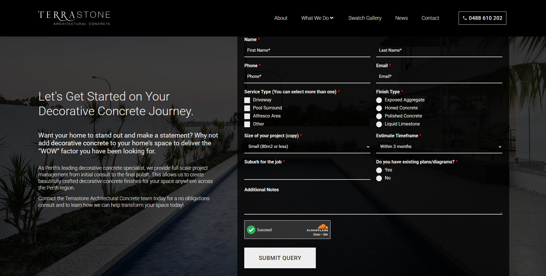
A referred customer is not necessarily a convinced customer. A recommendation gives them a reason to visit, not permission to be vague. Confirm the service, the relevant area or audience, and the next step. If your contact form asks for a long project brief before anyone will speak to them, consider whether that is the right first hurdle for someone who simply wants a conversation.
This article follows the same order. The quick route to contact sits near the top, and the rest of the guide is for anyone who wants to understand the thinking first.
Customer two: the emotional decision maker
Most customers make an emotional decision before they can neatly explain it. They want to feel that your brand, business, product or service is right for them. Facts still matter, especially when money and reputation are at stake. But a list of capabilities rarely answers the quieter question: will these people understand us and handle this properly?
The middle of the page carries that work. It should name the situation the customer recognises, explain your approach in human terms and provide proof they can judge. Show that you understand what is difficult about the decision. Tell the story of how you work without turning the page into a company autobiography.
Take a business owner considering a new website. They might have a site that looks acceptable but produces few useful enquiries. They may also be wary of paying for another redesign that changes the colours and leaves the underlying problem untouched. A useful middle section would acknowledge that worry, show how the page structure is planned around customer questions, and explain how the work moves from discovery into design and development. The reassurance comes from the method, not from saying “trust us”.
Proof needs to support the point you have made. A relevant project with a clear explanation of the brief and what changed is more useful than a rotating wall of compliments. If you use a testimonial, identify the customer with permission and keep their words intact. If you claim a result, be able to show how it was measured. Good proof gives the reader grounds for confidence without asking them to take an adjective on faith.
Belonging matters too. A professional services firm wants to recognise its world in the examples, language and questions on the page. A trades business wants to see that you understand how a lead arrives between jobs, not just during office hours. The aim is not to flatter every reader. It is to make the right reader feel that the page was written with their situation in mind.
Customer three: the know-everything visitor
This person wants to know everything about you, the product and the service before they commit. At Optimise Online we call them our trickiest clients, and often our best advocates. They ask exact questions, notice gaps and want to understand what they are agreeing to.
Do not treat them as an inconvenience or hide the answers behind a sales call. Address them from the top to the bottom of the page. The opening still needs to state the offer accurately, because they will test every later detail against it. The middle gives them the reasoning and evidence. The latter part carries the important specifics: what is included, how the process works, who does the work, what decisions they will need to make and what happens next.
For a website project, that might mean explaining who prepares the copy, whether existing content will be migrated, how feedback rounds work, who owns the finished site and what happens after launch. You do not have to promise the same answer to every project. You do need to say what is settled, what depends on scope and when those decisions are made.
Detailed information belongs lower down because it should not slow a referred visitor who just wants to call. Lower down does not mean buried. Use descriptive headings and short, answer-first paragraphs so a careful reader can scan to the question that matters. A useful FAQ can handle specific concerns without repeating the sales pitch.
If the page cannot answer a reasonable objection, note it as a content gap. More words will not fix it if the business has not made the underlying decision. Clear scope, real process and honest limits are stronger than a reassuring sentence that falls apart in a meeting.
How does the framework fit all three customers on one page?
The three-customer lens helps you arrange the information. The Customer Saga Framework supplies the narrative behind it. Its eight parts move the visitor through a decision without making the business the star of the story.
- Hero section: Identify the offer and make the next step visible. This serves the person who is ready now.
- Hero’s desire: Name the outcome the customer wants, in their terms rather than your service catalogue.
- The problem: Show you understand what stands in the way, including the cost of leaving it unresolved.
- Meet the mentor: Explain why your business is equipped to help, with evidence and a relevant point of view.
- Simple plan: Give the visitor a manageable picture of how working together starts and progresses.
- Raise the stakes: Make the consequence of inaction clear without inventing urgency or frightening people into a decision.
- Features and benefits: Explain what is included and why each element matters to the customer’s outcome.
- Happy ending and call to action: Show what a sound result looks like and give one clear next step.
These are functions, not a demand for eight identical blocks on every website. A short service page may combine several. A complex project may need more room for the plan and details. The test is whether the visitor can follow the logic and find a path that matches how ready they are to act.
Try the three-customer test on your own website
Choose one page that matters to your enquiries. Open it on a phone, then ask someone unfamiliar with your business to read it. Give them three distinct tasks, one at a time. Resist the urge to explain the page while they work through it.
- Act as the referred visitor. Can they tell what you do, whether you can help them and how to get in touch before scrolling far? Ask what they would tap first.
- Act as the cautious buyer. Which sentence suggests you understand their situation? What evidence would help them feel comfortable speaking to you? Watch for claims that sound reassuring but prove nothing.
- Act as the detail seeker. Can they find the process, scope, practical conditions and answer to their main objection? Note every question the page leaves open.
Do not grade the page by whether your tester likes the design. Ask them what they understood and where they hesitated. If they misstate the service, rewrite the opening. If they cannot see themselves in the page, sharpen the middle with relevant examples and proof. If they cannot find terms or process details, add those answers under headings they would actually look for.
A hypothetical example makes the trade-off clear. Imagine a builder’s website opening with a full-screen photograph and “Built on trust”. A referred visitor cannot immediately confirm whether the firm handles commercial fit-outs. A cautious buyer sees no explanation of how site disruption is managed. A detail seeker cannot find the project stages or what happens when scope changes. A more elaborate photograph would not solve any of those three problems. Better information, placed in the right order, would.
What should happen before the website is designed?
Start with the customer’s questions and the action each page is meant to support. Work out which visitors arrive ready to talk, which need to feel understood and which need substantial detail. Then decide what evidence the business can honestly provide. Only after that should the layout and copy be settled.
This is the approach behind Optimise Online’s Website Design & Development Services. A website needs to be clear about its purpose before it can be judged by its appearance alone. Design and development give the content shape and function; they cannot compensate for a missing answer to the customer’s question.
The same distinction applies to traffic. A visitor from a paid ad has not necessarily met your business before. Their first view should confirm the promise they clicked, explain who you are and make the next step obvious. An article can still teach at length, but it cannot assume the reader arrived with borrowed trust. Nor can it promise a result the page does not substantiate.
Where do you go from here?
Look at your most important page through all three sets of eyes. Make contact easy for the person who is ready. Give the person weighing you up a reason to feel understood. Give the person who reads every line the answers they came to find. Used well, the three customers help you decide what earns its place on the page. Which of them is your current website making work hardest?
If you are planning a new website, or your current one does not make that journey clear, get in touch with Optimise Online for a discovery conversation. Tell us what the site needs to do, who needs to use it and where people currently hesitate. We can then discuss whether our website design and development approach is the right fit.